Institutional Identity
Clear and consistent use of American University's institutional identity allows us to reach our objectives of supporting an engaged community, informing our audiences, and attracting support for our initiatives.
American University Logotypes
Use the American University Washington DC Stylized logo in these three configurations. Do not use the logo in any other configuration. Do not publish the images below.

Official logo colors
Red Pantone 186
- CMYK
- 0 100 80 0
- RGB
- 224 38 60
- HEX
- #E0263c
Blue Pantone 072
- CMYK
- 100 79 0 0
- RGB
- 0 79 163
- HEX
- #004FA2
*Tru Match: 36-A2 CMYK: 100 70 0 12 *for large blocks of print coverage
Clear Space
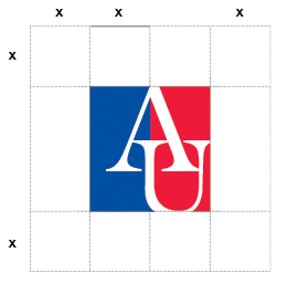
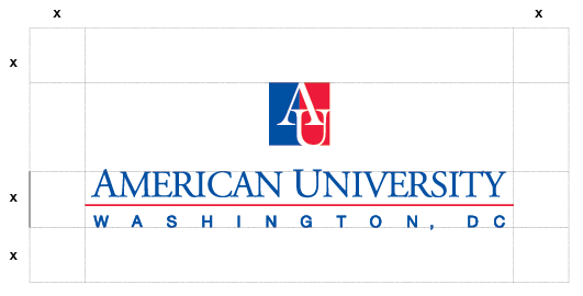
Keep the AU logo a minimum distance away from surrounding artwork or text. The clear space is half the height of the primary mark horizontally and vertically. Addresses are an exception as they may fall within the minimum encroachment area.

AU Stylized
Determine the logo colors by background and medium.

Follow these rules:
- Do not use two-color version on a red background.
- Do not change the logo color or any of its components.
- Do not stretch or apply effects to the logo.
- Do not break the logo apart or use any of its pieces.

Downloadable Files
Pngs for the standard, horizontal, and vertical American University logos are available for download. The included engraved marks are reserved for use when the primary logo versions cannot be applied.
Logo Files (Internal Only)
Consistent use of the university's logos and marks by members of the community, as well as approved use by those who wish to associate with the university, is essential. Logos may not be altered or modified in any way. Proper use of the logo should conform with the guide to Trademarks of American University. All use of the marks for commercial resale or noncommercial promotional distribution must be contracted through a licensee registered with Learfield Licensing Partners.
For more information and additional logo formats please contact brand@american.edu.
Challenge Accepted
The visual and textual guidelines here are the foundation of all Challenge Accepted communications. They celebrate AU as a place where purpose is nurtured, honed, and activated—sparking positive change and empowering us to bring Challenge Accepted to life.
Challenge Accepted Wordmark
We are living in a time of unprecedented challenges. Across American University, we leverage the power and purpose of community to make an impact in this changing world. There is no issue too complex, no challenge too great. From social justice to sustainability—we step up, we show up, and we say, “challenge accepted.”

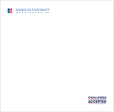
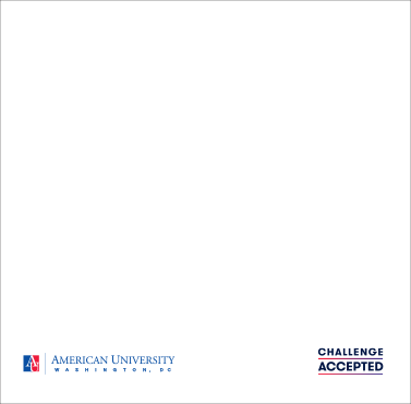
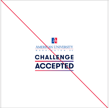
In all communications, the AU logo or school/institute wordmark should come first; the brand wordmark follows. Adequate space should separate the two marks. Use diagonal space, horizontal space, and front and back placement to separate the two. The logo and wordmark should not sit directly on top or beside one another.
 |
 |
 |
Colors
Our color palette is inspired by AU’s institutional colors: red, white, and blue. The Challenge Accepted Gradient is inspired by the juxtaposition of AU’s institutional red and blue; it is a feature element that should be applied to the brand campaign’s hero photography and used judiciously in other applications. Use the highlight colors sparingly where needed.
Brand Gradient
(Always first, left)
AU Red
C0 M100 Y80 K0
R224 G38 B60
Gradient Midpoint: 45%
Angle: -45°
(Always second, right)
Suffragist Purple
C94 M100 Y5 K2
R60 G32 B140
Institutional Colors
Logo
AU Blue
- CMYK
- 100 79 0 0
- RGB
- 0 79 163
- HEX
- #004FA2
AU Red
- CMYK
- 0 100 80 0
- RGB
- 224 38 60
- HEX
- #E0263c
Highlight Colors
Blue
Intern
- CMYK
- 100 66 0 76
- RGB
- 24 36 73
- HEX
- #182449
Embassy
- CMYK
- 99 77 9 0
- RGB
- 8 82 153
- HEX
- #005099
Botany
- CMYK
- 63 34 0 0
- RGB
- 105 149 221
- HEX
- #6995DD
Red
Tenleytown
- CMYK
- 1 100 80 20
- RGB
- 196 18 47
- HEX
- #C4122E
Row House
- CMYK
- 26 99 89 25
- RGB
- 150 30 40
- HEX
- #961e28
Purple
Indigo
- CMYK
- 82 85 0 0
- RGB
- 73 24 205
- HEX
- #4918CD
Suffragist
- CMYK
- 94 100 5 2
- RGB
- 60 32 140
- HEX
- #3C208C
Green
McKinley
- CMYK
- 93 0 57 0
- RGB
- 0 179 152
- HEX
- #00A38D
Arboretum
- CMYK
- 100 0 66 30
- RGB
- 29 127 102
- HEX
- #1c7f66
Silver/Gray
District Gray
- CMYK
- 2 1 0 13
- RGB
- 217 220 227
- HEX
- #D9DCE3
Metro Silver
- CMYK
- 49 36 27 1
- RGB
- 138 149 165
- HEX
- #8A95A5
Black
Talon
- CMYK
- 70 60 57 43
- RGB
- 65 69 71
- HEX
- #414547
Beltway
- CMYK
- 0 0 0 100
- RGB
- 0 0 0
- HEX
- #000000
Typography
Two typefaces comprise our typographic system—GT Walsheim and Adobe Garamond. The main brand typeface is GT Walsheim.
Substitute standard Microsoft or MacOS system fonts—Arial and Garamond—if GT Walsheim or Adobe Garamond are not available for applications such as email, presentations, invitations, etc.
Primary Fonts:

Use this sans serif font for headlines, subheads, and web copy.

Use this serif font primarily for body copy in print materials.
See the Challenge Accepted brand guidelines for design examples that illustrate optimal use of the brand visual identity guidelines.
Brand Guide (internal only)
